
Celebrating 10 Years of Nikkei x Financial Times
2025 marks a special milestone for the Financial Times as it's the 10th anniversary of Nikkei’s ownership of the paper. To celebrate, we were commissioned to design an installation that brings together the heritage of both institutions, one British and one Japanese, by creating woven panels for a touring installation.
We were excited by the opportunity to intertwine cultures, colours and traditions while creating spaces for storytelling, relaxation and exchange. The project needed to honour ten years of Nikkei and the Financial Times, while also celebrating the creative dialogue between British and Japanese traditions.


The Financial Times is instantly recognisable by its soft pink pages, while Nikkei is known for its authoritative blue. These two colours became our foundation. Across the installation, the panels gradually shift from pink to blue, guiding the viewer through the space from light to dark. The woven threads of both colours combine to create a visual metaphor for the partnership between the two companies.
In designing the installation, we looked to Japanese architectural traditions. The shoji screen divides space while allowing light to filter through, and noren curtains serve as thresholds between rooms. Both create a sense of intimacy and openness at the same time, and are used throughout traditional Japanese spaces.
We also drew inspiration from the distinctive newspaper itself. Each panel was designed with six columns separated by gutters, echoing the familiar layout of the printed FT. Contrasts of subtle pattern beside bold graphic detail mirror the relationship of text, image and headline on the pages of the newspaper.


The design team wanted to further reference the newspaper in this project, so it was decided early in the project to experiment with weaving with paper! It was too delicate to use successfully alone but we sourced an innovative Japanese paper yarn that is blended with hemp, which would provide the quality needed to manufacture the panels. The yarn was dyed, woven and processed at the mill in Lancashire - as always, the team at Mitchell Interflex embraced our ideas and approached this experimental project with enthusiasm! The result was material that is both delicate and strong, with the feel of paper but with the durability needed for a large-scale, touring installation.
We used loose gauze weaves, which created areas of transparency and windows within the panels. When suspended, these openings would layer visually, allowing visitors to see through in places from one panel to the next. The effect is immersive, with intimate spaces forming between the hangings.


This was our first time weaving on power looms with paper yarn at such scale, which required a completely new way of thinking - and there were many 'challenges' along the way! Unlike scarves or blankets, the panels needed to be architectural in character, rigid enough to be suspended yet visually dynamic both up close and from a distance.
The Financial Times has a very distinctive and recognisable colour, so mixing the exact FT pink to go with the Nikkei blue shades was vital. We are known for our love of colour, and our usual retail collections have wide and varied palettes, with surprising combinations. This project used only two colours, but we embraced this restriction and enjoyed creating visual interest with the variations of density and weight of the pink and blue.
As an international partnership, Nikkei and FT had events planned in Cannes, Washington and London so preparing the panels for travel and repeated installations was another challenge! Each one was carefully packed in flight boxes with specialist padding and identified by its own embroidered reference number, ensuring they could be installed securely in different locations around the world.


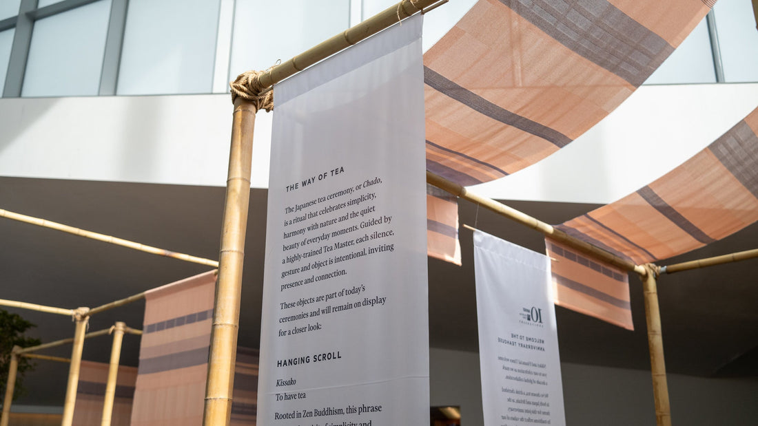
The final event of the celebrations was the FT Weekend Festival at Kenwood House, London. As well as defining the tea ceremony space, serving an exclusive blended tea by Fortnum & Mason's, we were commissioned to design a collection of lambswool products, using the paper panels from the installation as inspiration.
Visitors to the festival could purchase the exclusive lambswool throws, cushions and scarves, as well as Fabriano notebooks featuring details of the woven paper hangings, and Luisa Cevese accessories made using the selvedge fabric from the loom. Our design was also printed on the festival tote bags given away to every single visitor!


Collaboration has always been at the heart of Wallace Sewell. Over the years we have had the privilege of working with renowned brands and institutions on projects that span innovation, sustainability and heritage.
From commissions to guest designing, bespoke collections to exclusive retail projects, you can discover them all on our 'Projects' page of the new website.
Each of these projects reflects our passion for weaving stories into cloth. As with the Nikkei and Financial Times installation, they demonstrate how textiles can connect people, cultures and ideas. We are always open to new collaborations and look forward to exploring what the future holds.


